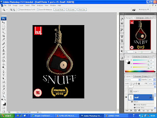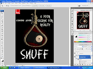

After researchinjg the types of posters used for these films it become clear that they rely alot more on a central dominating image with things like titles and comments surrouding it with an index and age rating at the bottom to let the public know who its suited for and who was involved in its creation.
Intial designs stuck to the rules by creating a central image being a noose with the actual cursed DVD placed in the center of the rope with a red highlight behind to enhance the eerie feel of the whole film. Photoshop prved very useful and not as complicated for what was needed and through the manipulation of layers proved quite simple since it only involved taking images and placing them on top of eachother and then making adjustments accordingly.
However sticking too closely to the rules made the poster appear too minimalistic and uninteresting even when the title and comments were added, this required alot more thought into the actual layout of the various layers and the adding of some more comments, awards and a taster phrase that suited the film to go along side the title so that the films plot and message are made clearer in the design.
But in terms of colour and images used these stuck more solidly to the rules using a black background and very darkly lighted images that help enhance the titles and comments for the audience to be able to read while still not being too distracted enough to understand what the images mean.

In the end it all came down to this final design which will be used as the final copy with afew more comments added with the central image being stretched to make it more apparent, the use of comments makes it look more like a more low budget film sicne bloackbusters don't have to use their posters to adevertise their films as much since people will here about them some other way hwoever low budget posters tend to include alot more comments to sell the film more .
After the audience research it was made clear that people expect this film to succeed more in the film festival scene which imspired the idea to put the film festivals rating onto the poster so that the audience know that despite it being a low budget, short film it has been watched and rated highly by a varied public audience and thus has alot going for it in terms of audience satisfaction.

No comments:
Post a Comment